UX Case Study · Health & Wellbeing · 2024

SafeFit
Compass.

Personalised musculoskeletal recovery — designed for the moment motivation fails.

DesignerMohammed Sameer
RoleUX Researcher & Designer
ProjectTeam · 8 weeks · Health & Wellbeing
TargetSenior Product Designer · Series B–C HealthTech
StandardIDL-ARC Series · Rebuilt by Invariant Design Labs
hero
quickmed1
progress
01 · The constraint, not the category

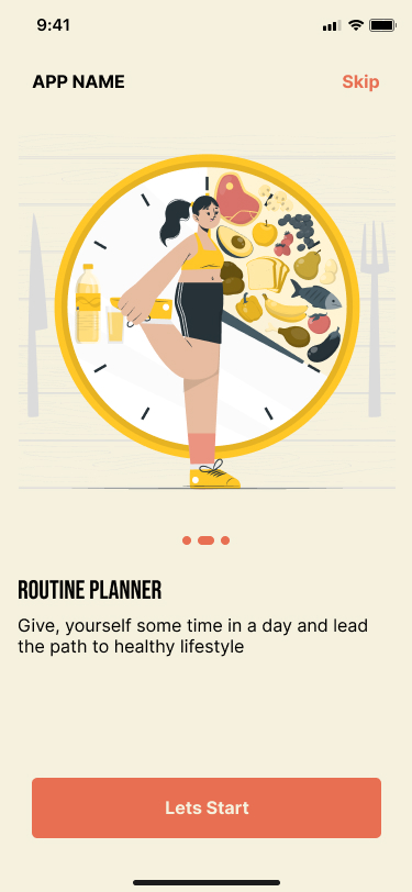
Designed for the moment
motivation fails.

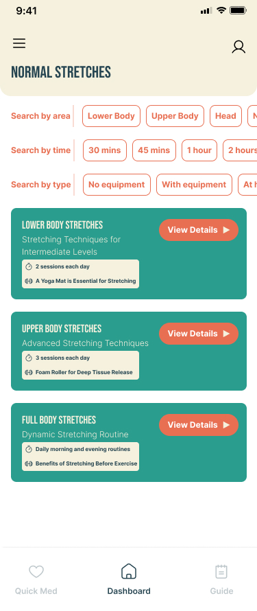
Consumer fitness apps are built for motivated users. Every design decision — gamified streaks, aspirational onboarding photography, goal-setting prompts — assumes the person opening the app wants to be there. SafeFit Compass is built for the opposite: the moment when a user is in pain and afraid of making it worse.

People managing musculoskeletal conditions approach fitness apps with fear rather than motivation. Fear that a generic exercise plan won't account for their injury. Fear that pushing through the wrong movement will set back weeks of recovery. Fear that the app — like the ones they've already abandoned — will make them feel worse, not better. That emotional state is the primary design constraint, and it shapes everything downstream.

"I worry I'll hurt myself if the app doesn't guide me properly." — Survey respondent, SafeFit Compass research, 2024

Existing consumer fitness platforms fail at this constraint structurally. Fitbit and MyFitnessPal optimise for general fitness tracking — no injury-aware guidance layer. Physitrack has clinical guidance but no immediate relief pathway and no motivational mechanics. None of them address the full problem: a user who needs reassurance before motivation, and fast access to pain relief before they're ready to think about long-term recovery programming.

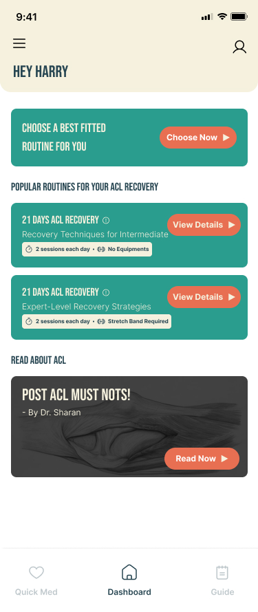
SafeFit Compass addresses this gap by combining injury-aware exercise guidance, an immediate pain relief pathway (Quick Med), progress tracking, and motivational features in a single experience. As the UX researcher on this team, I built the evidence base that proved this combination was necessary — and that the architecture needed to be built around the reactive relief moment, not the planned workout moment.

Attribution note: SafeFit Compass was a collaborative team project. Mohammed's documented contributions are user research and literature review, persona artefacts, ideation and concept input, and usability testing support. Screen design, visual system, and IA architecture decisions are attributed to the team.
Onboarding entry
Onboarding entry
Personalisation setup
Home screen
Home screen
Recovery dashboard
Recovery dashboard
02 · Research intelligence

Four conclusions —
not four data points.

The research produced four user insights. What matters is what I concluded from them, which findings I weighted, and what I argued for in response.

D01 · Research-to-decision chain — four findings → four features
RESEARCH FINDING FEATURE DECISION Reactive moment is primary use case Journey map: discomfort triggered engagement Fear of injury reduces confidence Survey: 75% need condition-aware plans Onboarding friction is a trust failure Journey map: hesitation before continuing Visible progress prevents drop-off Survey: 65% · journey map: motivation trough Quick Med as primary pathway Under 5 steps from any app state Colour-coded safety guidance Injury contraindications surfaced inline Minimum viable onboarding Full profile deferred post-first-session Progress on homepage, not profile Surfaced at the motivational trough D1 D2 D3 D4 D01 · SafeFit Compass · Research-to-Decision Chain

Finding 1 — The most consequential number was not the largest

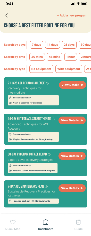
The survey produced four statistics: 75% wanted customised plans, 65% said progress tracking was essential, 60% expected wearable syncing, and 55% preferred video guidance. These are not the same kind of finding. The 75% customisation finding is a validated core need. The 60% wearable syncing finding is a preference reflecting category expectations — not a recovery-specific need. I weighted these differently when arguing for scope.

Finding 2 — The journey map proved the reactive hypothesis

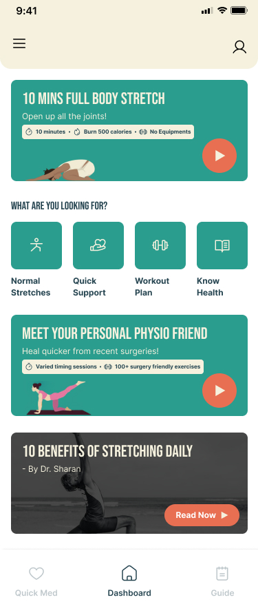
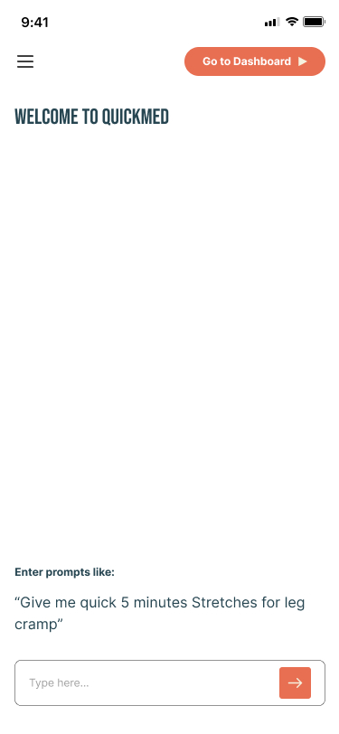
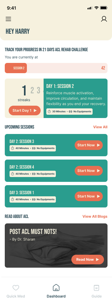
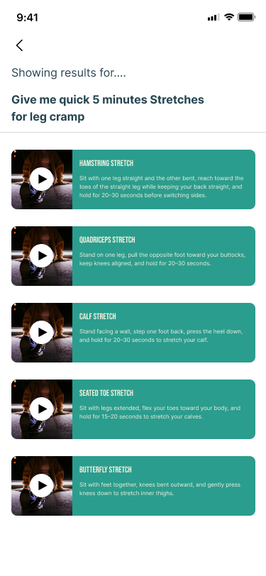
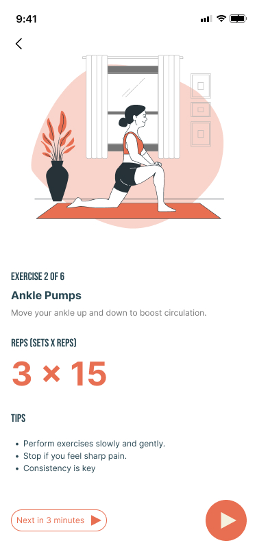
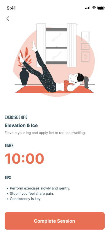
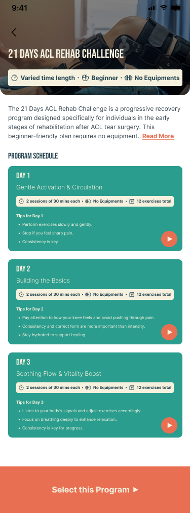
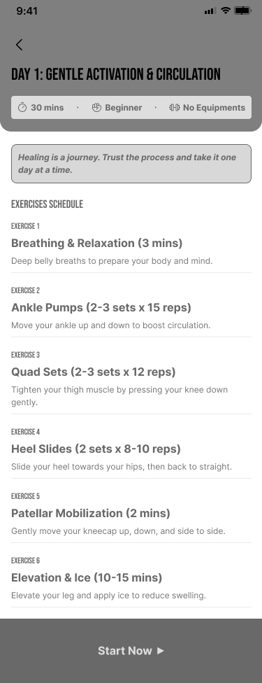
Users interacted most actively at the Quick Med stage — moments of discomfort triggered engagement, not scheduled workout times. This proved that the primary use case for SafeFit Compass was not planned exercise — it was reactive relief during a pain episode. That conclusion drove the decision to position Quick Med as the primary navigation pathway.

D02 · Emotional arc journey map — five stages · confidence curve · design decision callouts
LOW CONFIDENCE MID HIGH ENGAGEMENT Onboarding Apprehensive Exercises Uncertain Homepage Passive Streaks Dropping Quick Med Urgent, engaged Spike = proof reactive hypothesis Simplified setup Safety coding Progress surfaced Badge on completion Primary pathway D02 · Emotional Arc Journey Map · SafeFit Compass

Finding 3 — Cognitive load at onboarding was a trust failure

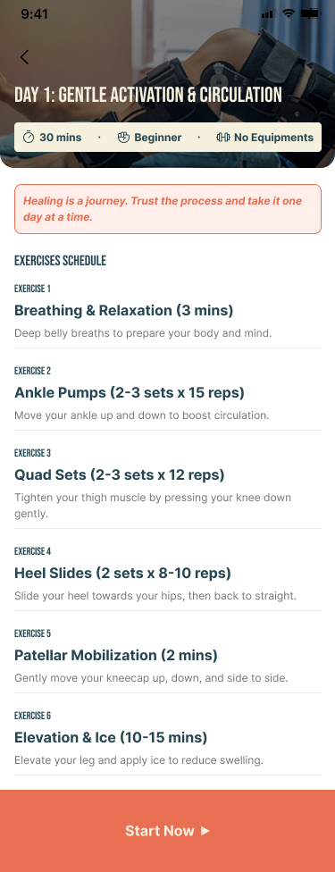
Users hesitated at setup not because of form length but because of fear of committing before understanding whether the app could be trusted with their injury. That distinction changed the design argument: the minimum viable personalisation set was the threshold at which the product could deliver value without asking the user to trust it completely first.

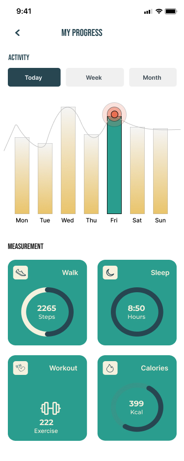
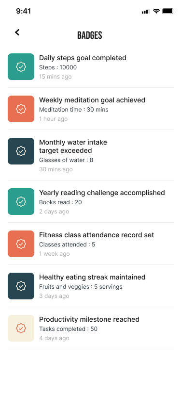
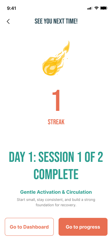
Finding 4 — Progress visibility was a retention mechanism, not gamification

For users who have previously abandoned fitness apps because of injury, visible progress provides the reassurance the design constraint requires. I argued for a recovery-framing register rather than competitive-fitness framing — the difference is meaningful for users afraid of over-exertion.

Progress tracking
Progress tracking
Achievement badges
Achievement badges
Post-session dashboard
03 · Decision records

The four arguments that
changed the product's structure.

Four design decisions in SafeFit Compass trace directly to my research. These are the ones I argued for specifically — where the research produced a conclusion that changed what got built. Click each to expand the full decision record.

Quick Med entry
Quick Med entry
Body map interaction
Relief exercises
Relief exercises
Injury selector
Injury selector
Exercise demonstration
Safety colour-coding
Step-by-step guidance
04 · The product argument

Why these four features,
in this priority order.

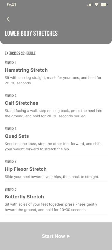
SafeFit Compass is the only platform combining injury-aware exercise guidance, immediate pain relief recommendations, progress and recovery tracking, and motivational features in a single experience. That combination is not accidental — each feature area maps to a specific research finding.

Research finding
Feature response
Priority logic
Reactive relief moment is the primary use case (journey map)
Quick Med — immediate pain relief pathway
Primary / v1 — structural anchor of the IA
Fear of injury reduces confidence (survey + journey map)
Injury-aware safety guidance — colour-coded exercise demonstrations
Primary / v1 — enables first-time use
Visible progress prevents motivation drop (survey: 65% + journey map)
Progress tracking — homepage-surfaced badges and activity log
Primary / v1 — retention mechanism
Busy schedules require short, accessible exercises (survey)
Personalised exercise plans — short condition-specific routines
Primary / v1 — core differentiation

The wearable scoping decision

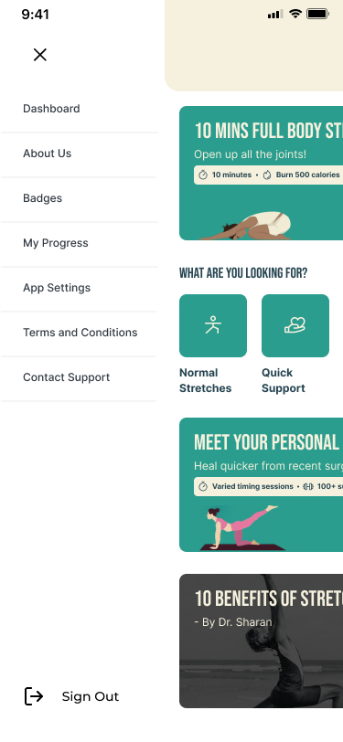
60% of surveyed users expected wearable syncing. The IA includes a Wearables Link entry point in the profile section. The team scoped full wearable integration out of v1. The research-based argument: wearable syncing is a preference driven by category familiarity, not a need that directly addresses the fear-of-re-injury constraint. A user who is afraid of hurting themselves needs injury-aware guidance and fast access to relief — not their step count imported before they trust the app. Full integration is the correct Phase 2 investment.

⚑ CP2 Review — Wearable scoping
Confirm with Mohammed that the team explicitly deferred full wearable integration to Phase 2, and that 'reduce onboarding friction / establish trust first' was the argued rationale. If the actual decision was different, update this framing before publishing.
Injury-specific programme
Routine selection
Routine selection
Routine overview
Routine overview
Profile & wearables link
Day 1 plan
Day 1 plan
Day 2 plan
Day 2 plan
Day 3 plan
Day 3 plan
Weekly view
Weekly view
05 · Usability as validation

What the testing confirmed —
and what Mohammed identified.

95%Task completion rate across all usability sessions
4.8/5User satisfaction · post-session rating
<5sQuick Med access time · validated across 10 participants

These numbers are not incidental — they validate specific research hypotheses. The 95% task completion rate validates the IA decision: structuring around user intent rather than feature grouping let users navigate without orientation overhead. The under-5-second Quick Med access time validates the primary pathway decision directly.

D03 · Quick Med access flow — annotated · research finding per step · Mohammed's contribution
ANY APP STATE → FIRST EXERCISE — UNDER 5 SECONDS Any state Home / exercises Quick Med Bottom nav tap Body diagram Tap injury location Confirm pain One tap: sharp / dull Exercises Safety coded cards First exercise Video demo loads Persistent nav Reactive finding Loads instantly No loading state 44pt min target Haptic on select Min viable input Cognitive load Issue 4 + survey fear of injury Validated: <5s 95% completion RESEARCH ANNOTATIONS 1 — Persistent nav: journey map reactive engagement finding drove Quick Med into bottom nav 2 — No load state: pain-episode users cannot wait. Instant load is a product requirement 3 — Haptic feedback: Mohammed identified touch target abandonment (Issue 1) 4 — One tap: cognitive load finding — minimum viable interaction before first relief delivery 5 — Safety coding: Issue 4 + survey fear-of-injury finding — safety visible before exercise begins USABILITY TEST RESULT 10 participants · 100% reached first exercise within 5 seconds · Participant #3: found relief within seconds of back pain at work MOHAMMED'S CONTRIBUTION Identified touch target abandonment (step 3) as separate from comprehension failure — changed design brief from 'simplify the diagram' to 'increase target + add haptic.' Argued haptic as lowest-friction fix given visual design lock. D03 · Quick Med Access Flow · SafeFit Compass

Individual attribution — what I identified in the session

The testing session produced four issues. As the researcher who ran the session, I had a different view of these findings than the aggregate data shows.

D04 · Usability finding attribution board — issues 1 & 4 attributed to Mohammed · issues 2 & 3 team
ISSUE OBSERVATION TYPE DESIGN RESPONSE BY Issue 1 Body diagram touch targets too small Usability testing Task abandonment pattern Users failing to select injury location — not comprehension failure 44pt min touch target Haptic feedback on selection (lowest-friction fix, visual design locked) Mohammed Identified pattern argued for haptic Issue 2 Progress badges not visible after exercise completion Motivation signal gap Retention mechanism arriving too late Animated badge on session completion Dashboard indicator Team Issue 3 Exercise variety insufficient for user conditions Scope gap Library does not cover full conditions range Expand exercise library pre-launch with guided recovery routines Team Issue 4 Safety cues not visible during exercise demonstrations Safety communication failure Users skipping exercises from uncertainty — not difficulty Changed design brief Colour-coded guidance Clearer warning indicators on all exercise cards Mohammed Identified skip as safety-motivated D04 · Usability Attribution Board · SafeFit Compass

Issue 1 (identified by Mohammed): Participants were abandoning the body diagram interaction — not because they found it confusing, but because the touch targets were too small to hit accurately. I identified this as a task abandonment pattern, not a comprehension failure. I argued specifically for haptic feedback as the lowest-friction fix, given the visual design was already locked.

Issue 4 (identified by Mohammed): Participants were skipping exercises because they could not assess safety, not because they lacked motivation. That distinction changed the design brief from "simplify exercises" to "improve safety communication."

⚑ CP2 Review — Usability attribution
Confirm with Mohammed that he personally identified Issues 1 and 4. If he led on different issues, update the attribution — the goal is that at least one issue carries his specific analytical fingerprint.
Routine completion
Routine completion
Session dashboard
Session dashboard
Body map — touch target fix
Navigation structure
06 · Outcome intelligence

What would prove
this product works.

Usability results prove the product is usable. They do not prove it works. For SafeFit Compass, "working" means users managing musculoskeletal conditions use the app during pain episodes, complete exercises without fear of worsening their injury, and return consistently enough for recovery to have clinical value.

Metric
Definition
Target
Validates
Quick Med return rate
% using Quick Med more than once within 7 days of install
>50%
Quick Med solves a recurring problem, not first-session novelty
Exercise completion rate
% of started sessions completed without abandonment
>70%
Safety guidance and short routines reduce mid-session drop-off
14-day retention rate
% opening app on day 14 after install
>35%
Progress visibility creates habit formation — the motivation finding
Onboarding completion
% completing setup and reaching the home screen
>85%
Onboarding simplification decision — the cognitive load finding
Self-reported pain confidence
User-rated confidence in exercise safety at day 7 vs. day 1
Measurable improvement
The product reduces fear of re-injury over time — the core constraint

If 14-day retention fell below target, the first investigation would focus on the progress visibility gap identified in usability testing — specifically whether badge notification timing was calibrated to exercise completion moments. First design hypothesis: immediate post-session reward delivery rather than delayed notification.

07 · What I would build next — and why

A prioritised argument,
not a list of options.

The three future directions are not equivalent. AI-driven personalisation, community support, and healthcare professional integration address different problems at different levels of proximity to the core constraint.

01 · First priority
AI-driven personalisation
The research proved that generic plans caused the fear-of-re-injury problem. Adaptive plans — adjusting based on pain diary entries, Quick Med usage patterns, and session completion rates — are the direct product-level response. The metric that would justify this investment: Quick Med return rate. If users repeatedly reach for Quick Med rather than completing the guided plan, the plan is not adapting to their recovery pace.
02 · Second priority
Healthcare professional integration
Integrating verified guidance from physiotherapists strengthens the safety communication layer — the same constraint that drove Decision 4. A user afraid of re-injury responds differently to 'exercises verified by a physiotherapist for lower back conditions.' This is Phase 3 because it requires supply-side partnership infrastructure the product does not yet have.
03 · Third priority
Community support
Community features have the weakest research basis of the three. The survey produced no finding that social connection was a motivating factor for this user population. The motivation drop identified in the journey map was addressed by visible progress indicators, not peer comparison. The research does not support prioritising it ahead of personalisation or clinical validation.
⚑ CP2 Review — Future roadmap position
Confirm with Mohammed that he would argue for AI personalisation first, with the rationale that it directly addresses the core fear-of-re-injury finding. If his actual position differs, update the argument — the goal is that this section reads as his analytical conclusion, not a framework answer.
Next Steps

Explore more work —
or get in touch.

This case study is part of the IDL-ARC Applied Research series. If you'd like to discuss the research approach or the design decisions, I'm available.

All Case StudiesGet in Touch